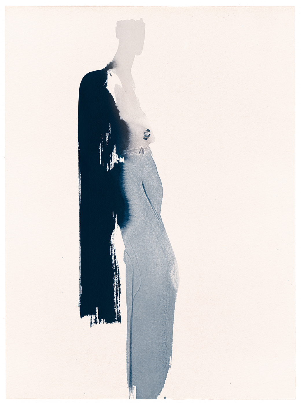
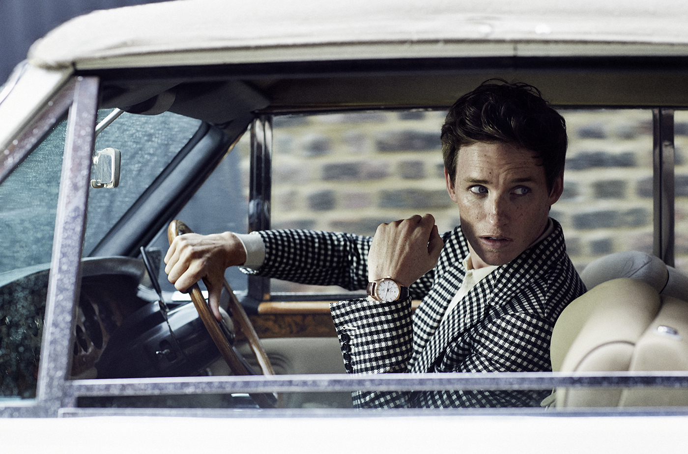
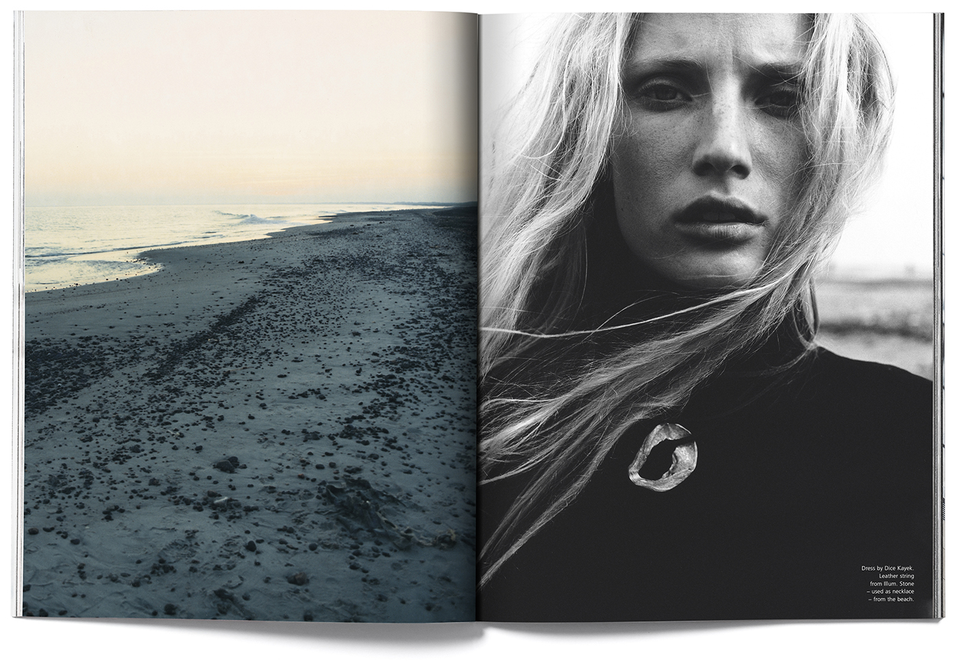
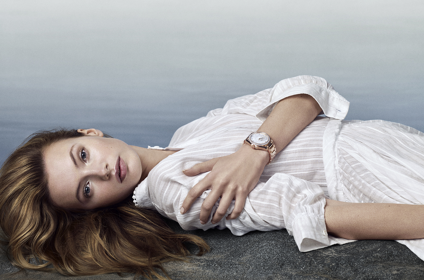
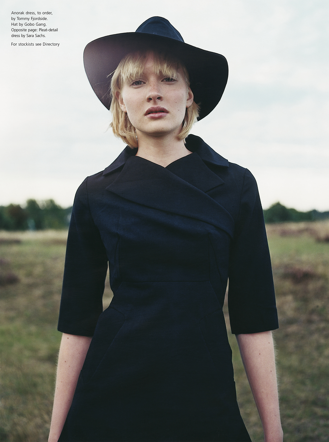
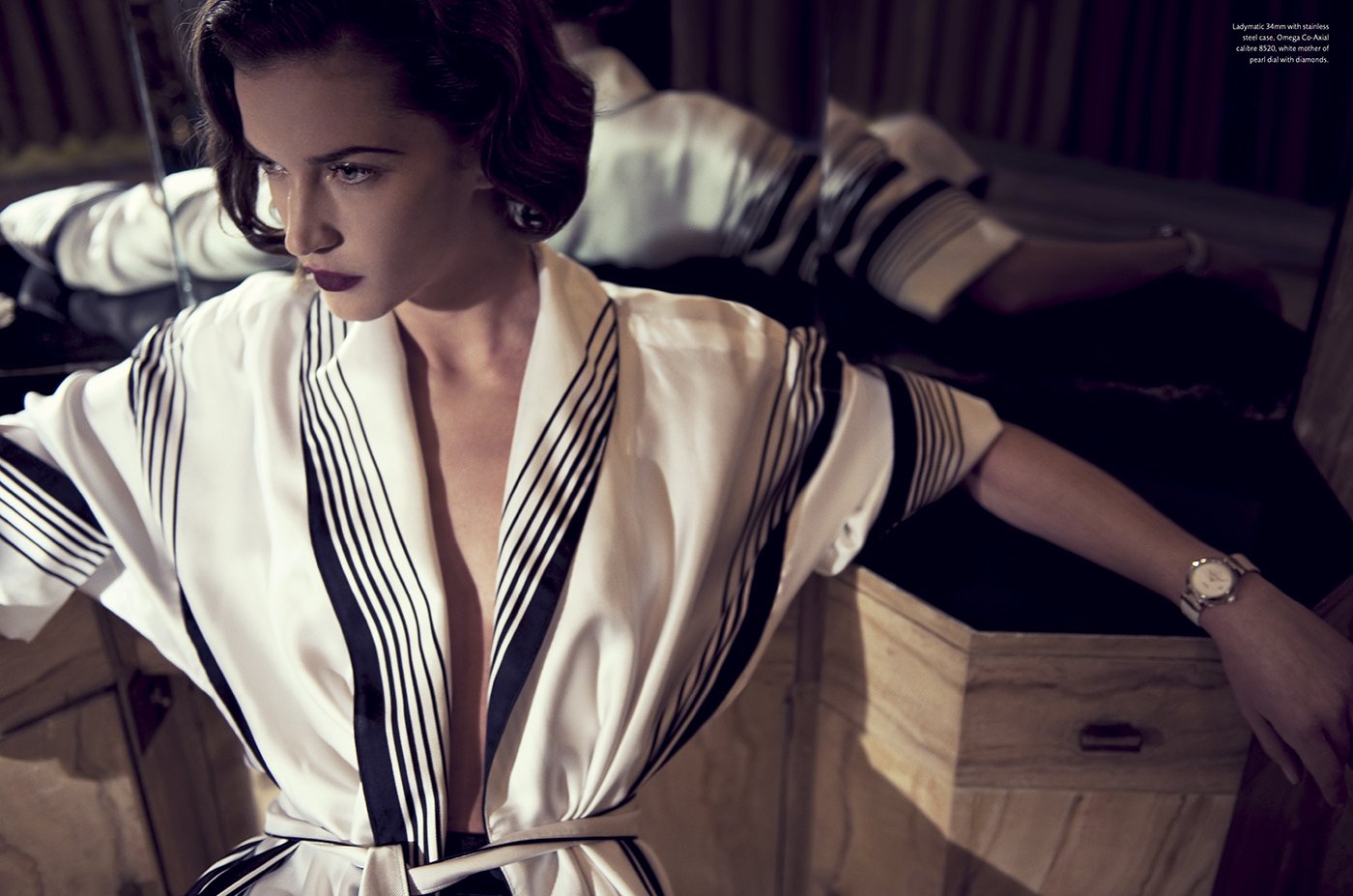
The Soft Revolution

The Soft Revolution

Since 2007, we have frequently created exclusive fashion features for Omega’s magazine Omega Lifetime, and The Soft Revolution is a prime example. The editorial draws inspiration from Art Deco – a design era that has played a significant role in watch design. The cinematic storytelling brings a modern edge to the iconography of this distinctive era.

The Gerber Family

Two Generations, One Choice

In 2017, Omega redefined its partnership with Cindy Crawford by featuring her entire family in a campaign that bridged two generations, appealing to both classic and contemporary audiences. With this campaign, we aimed to introduce Omega’s latest timepieces to a younger, style-conscious demographic without compromising the brand’s timeless elegance.

Photographed by Peter Lindbergh, the campaign embraced his signature mastery of natural light and black-and-white imagery. Shot in Malibu, the visuals radiated cinematic beauty and intimacy, portraying the Gerber family with effortless grace and reflecting Omega’s seamless blend of heritage and modernity.

The campaign unfolded across four sub-campaigns (as shown in spreads from The Family Edition of Omega’s brand magazine, Omega Lifetime) as part of the behind-the-scenes campaign introduction featuring the entire Gerber family.

One of the highlights among the sub-campaigns was the 360° launch of Omega’s Tresor Collection, spotlighting Cindy’s daughter, Kaia Gerber. As a leading model of her generation, Kaia embodied the collection’s sleek, modern elegance. Her youthful energy complemented Omega’s rich legacy, positioning the brand at the intersection of tradition and innovation.


Omega Constellation – 2018

Omega Constellation – Manhattan

In 2018, Omega launched a major campaign for their new Constellation Manhattan watch collection, featuring female ambassadors in a white studio setting with white podiums. The company approached us to create a complementary product campaign that echoed this concept. We delivered a visual campaign showcasing the Constellation watches against a ‘skyline’ of white cubes, thus reinforcing the Manhattan theme.

The interplay of light and shadow was meticulously crafted to maintain a sense of airiness, ensuring the background enhanced rather than overshadowed the central focus – the watches, with the high-gloss podiums reflecting their elegance. We produced multiple image variations tailored for use across PR channels and social media, amplifying the campaign’s reach and impact.

Copenhagen Living

Copenhagen Living

Copenhagen Living, a magazine dedicated to exploring ‘Denmark – its people, food, design, fashion, and architecture,’ shaped and nurtured a new identity for both the country and its capital – leaving a lasting impact despite its short publishing run from 1999 to 2001.

The magazine was the first independent title co-founded and published by Anders Peter Mejer, following six years of designing and art directing lifestyle and fashion magazines for various publishing houses.

At the turn of the millennium, Copenhagen was far from the vibrant, creative capital it is today. Its self-image and global perception were steeped in fairytale romanticism. From the outset, Copenhagen Living worked to redefine that image – showcasing Denmark through a contemporary lens that blended the country’s rich history with the city’s emerging creative energy.

Pickling, fermenting, editorial, Copenhagen Living, issue four, magazine. Graphic design, art and creative direction by Anders Peter Mejer

“Visually, my ambition was to create and capture a unique Nordic aesthetic. Much like Denmark’s iconic furniture designers defined Scandinavian style, I sought to develop a cohesive visual language that resonated throughout the magazine. My goal was for the magazine itself to be an artefact of design culture — embodying the same timeless qualities and thoughtful craftsmanship that make a Danish designer chair an enduring icon of design.”


Omega De Ville Trésor – 2017


Omega De Ville Trésor – Avantgarde Allure

For the launch of a completely new collection of women’s watches, Omega commissioned us to create a range of materials across multiple platforms. A standout element of the campaign was our collaboration with illustrator Aurore de la Morinerie, where we explored the intersection of fashion and women’s watches through both text and illustrations.

The material was utilized across social media, PR, and as featured layouts in Omega’s own magazine, Omega Lifetime. For the launch of the Omega De Ville Trésor collection, we also produced a major 360° campaign, starring model Kaia Gerber, alongside a savoir-faire PR campaign that highlighted the meticulous craftsmanship behind the watches.


Eddie Redmayne – Globemaster

Eddie Redmayne – Globemaster

This campaign not only introduced Omega’s brand-new Globemaster chronometer but also marked Eddie Redmayne’s debut in an Omega advertisement. Inspired by his hometown of London and the watch’s classic, elegant, vintage aesthetic, we aimed to capture the city’s nostalgic spirit and the impeccable style of the British gentleman.

We crafted a range of images beyond the main campaign shot, using the classic London backdrop to create portraits of Eddie wearing a selection of Omega watches. The result was a set of refined visuals that complemented the watches’ timeless character and were extensively featured across both print and online media.


Omega Ladymatic – 2015

Omega Ladymatic – Nicole Kidman

“In 2015, I was approached to create a new campaign for the Swiss watch brand Omega’s relaunched Ladymatic watches, featuring long-time ambassador Nicole Kidman. My aim was to develop a campaign that contrasted the watch’s glamorous design with a more casual, down-to-earth portrayal of Kidman.”

While most women’s luxury watch campaigns were traditionally characterised by extravagant gowns and high fashion, we aimed to break from this norm by presenting Kidman in a more natural, understated style – creating a subtle contrast with the Ladymatic’s refined elegance. Additionally, we sought to highlight Kidman’s behind-the-camera persona, adding a unique and authentic dimension to the campaign.

“The clean, classic look of the studio setting was an ideal match for French fashion photographer Patrick Demarchelier, whose aesthetic perfectly complemented my vision. The resulting images embodied a timeless elegance, presenting the Ladymatic’s refined beauty in a fresh, accessible way.”

A behind-the-scenes video for social media and a TV commercial incorporating footage from the shoot, further amplified the campaign’s reach and impact. The combination of casual elegance and high fashion successfully positioned the Ladymatic series, celebrating both the watch’s sophistication and Nicole Kidman’s multifaceted persona.


Omega Constellation – 2020

Omega Constellation – Peonies

For the launch of a new series of Omega Constellation women’s watches, we developed a floral-themed 360° campaign for the Chinese market, seamlessly combining product visuals with a high-profile celebrity endorsement. 

The visual narrative highlighted the precision craftsmanship of the timepieces alongside the elegance of nature. Soft floral tones complemented the watch designs and the tones of their materials, creating a refined and cohesive aesthetic.

Executed during the early weeks of the COVID-19 lockdown, the visuals featuring renowned Chinese actress Liu Shishi were photographed in Shanghai and art directed virtually from our office in Copenhagen. The large-scale floral billboards across China became an almost poetic symbol of resilience and beauty during the global lockdown.

Additionally, we developed a worldwide social media campaign and a series of alternative PR shots, all unified by the overarching floral theme.


The Museum Edition

The Museum Edition

Since the creation of the first issue of Omega’s brand magazine, Omega Lifetime, in 2007, each edition has explored a single, unique theme. In 2022, we took the concept further with our inaugural special edition: The Museum Edition. Designed not only as a brand publication, similar to previous issues of Omega Lifetime, this edition also doubled as a catalogue for the extraordinary Omega Museum in Bienne, Switzerland.

The Museum Edition serves as a tangible keepsake for museum visitors, providing a deep dive into the captivating stories behind key pieces from Omega’s remarkable horological collection. Enriched by stories from Omega’s 175-year history, it features narratives about notable individuals and their Omega timepieces, as well as comprehensive insights into the art of mechanical watchmaking.

Each watch featured in the magazine comes from the museum’s collection and was specially photographed for this issue. The magazine’s historical articles were further enhanced by collages created by Anders Peter Mejer, capturing the essence of Omega’s storied legacy by integrating archival material, historical clippings, and original artwork.

Once Upon a Time

Once Upon a Time

Lorem ipsum dolor sit amet, consectetur adipiscing elit, sed do eiusmod tempor incididunt ut labore et dolore magna aliqua. Ut enim ad minim veniam, quis nostrud exercitation ullamco laboris nisi ut aliquip ex ea commodo consequat. Duis aute irure dolor in reprehenderit in voluptate velit esse cillum dolore eu fugiat nulla pariatur. Excepteur sint occaecat cupidatat non proident.

Copenhagen Living

Copenhagen Living

Copenhagen Living, a magazine dedicated to exploring ‘Denmark – its people, food, design, fashion, and architecture,’ shaped and nurtured a new identity for both the country and its capital – leaving a lasting impact despite its short publishing run from 1999 to 2001.

The magazine was the first independent title co-founded and published by Anders Peter Mejer, following six years of designing and art directing lifestyle and fashion magazines for various publishing houses.

At the turn of the millennium, Copenhagen was far from the vibrant, creative capital it is today. Its self-image and global perception were steeped in fairytale romanticism. From the outset, Copenhagen Living worked to redefine that image – showcasing Denmark through a contemporary lens that blended the country’s rich history with the city’s emerging creative energy.

Poul Kjærholm, editorial, Copenhagen Living, CPH Living, issue one, magazine. Graphic design, art and creative direction by Anders Peter Mejer

“Visually, my ambition was to create and capture a unique Nordic aesthetic. Much like Denmark’s iconic furniture designers defined Scandinavian style, I sought to develop a cohesive visual language that resonated throughout the magazine.

My goal was for the magazine itself to be an artefact of design culture – embodying the same timeless qualities and thoughtful craftsmanship that makes a Danish designer chair an enduring icon of design.”


Tusnelda Bloch – Logotype

TUSNELDA BLOCH

“Three years into its journey, I led a comprehensive graphic rebranding for Tusnelda Bloch, a contemporary luxury fashion brand known for its sophisticated, minimalist women’s clothing that embodies a modern Scandinavian aesthetic.”

For the rebranding, we adopted a striking black-on-black approach to highlight the brand’s refined and minimalist ethos. This included uncoated black business cards featuring a glossy lacquered logo, shiny black-stitched logos on black brand labels, and other design elements that, while understated at first glance, created an elegant and powerful impression.

“The new logo featured a custom display typeface – an elegant Didone serif typeface, which I designed specifically for the project. This typeface strikes a balance between classic and modern elements, giving the brand a distinctive character and a sense of contemporary elegance.”

“I applied the same design philosophy to the campaigns I art directed for Tusnelda Bloch, seamlessly reflecting minimalist and classic themes with an artistic flair. For all marketing materials, the logo was used in negative against images, enhancing its visual impact.”


Valentine’s Day – 2014

Valentine’s Day

Inspired by artist Marton Pelaki’s artistic universe, we set out to redefine the Valentine’s Day campaign. Steering clear of the clichés often found in advertising based around February 14th, our goal was to encapsulate the essence of love and showcase Omega’s new watch collection through a lens of sophistication.

The result was a social media campaign for the Swiss watch company that portrayed romance with subtlety and impact, capturing attention through its elegant yet striking approach.


Experience Design

Immersed in Storytelling

In an era of rapid digital innovation, creating immersive storytelling experiences has never been more thrilling. Storytelling, once confined to paper and film, now thrives in interactive digital formats that captivate and engage audiences in unprecedented ways. At this intersection of narrative and technology, we draw on our deep expertise in visual design and storytelling to redefine the craft.

In 2019, Omega commissioned us to create a tailor-made cinematic experience for the 360° cinema in their new watch museum. The result? An immersive journey greeting visitors as their first experience upon entering the museum – a captivating eight-minute odyssey through time, from the obelisks of ancient Egypt to Omega’s revolutionary 19-line movement of 1894 – an unforgettable introduction to the history of timekeeping.

The museum’s immersive cinema surrounds visitors with a 360° screen and a central display table, which showcases an animated timeline of pivotal timekeeping innovations. Meanwhile, the narrative unfolds in a seamless blend of animation and live-action across the massive screen. This extraordinary experience was developed in close collaboration with the animation studio FGreat.

immersive design, experience design, the history of time, 360° film, movie, Omega Museum. Creative direction and art direction by Anders Peter Mejer Design

If you ever find yourself in Biel/Bienne, Switzerland – home to Omega’s headquarters – don’t miss the stunning Omega Museum. Housed in a cutting-edge building designed by renowned Japanese architect Shigeru Ban, it’s the only venue where the 360° film, The History of Time, is shown. 

Let’s collaborate to push the boundaries of immersive storytelling and experience design, blending the digital and the analog in extraordinary ways. Contact us to learn more – we’d be delighted to offer a personal virtual reality presentation of our work and explore how we can create something remarkable together.


Omega Liquid Metal – 2012

Omega Liquid Metal

How do you build an ad around a single material, especially when it’s just a subtle detail on a complex mechanical watch? That was the challenge Omega presented to us when they launched their first Liquidmetal® bezel. Inspired by the material’s name, we crafted a visual where the watch was photographed with what resembled small drops of ‘liquid’ metal.

Following the Liquidmetal® campaign, we developed a series of ads introducing other new materials, all with a consistent aesthetic. Like this one, showcasing Omega’s proprietary red gold – Omega Sedna®.


After the Storm

After the Storm

Fashion editorial for Copenhagen Living, created in 1999, driven by a clear and bold vision – to push the boundaries of Danish fashion editorials with a distinctly homegrown perspective. At the heart of the project was the desire to capture a Nordic atmosphere, using Denmark’s often-overlooked landscapes as locations, which were seldom featured in fashion editorials at the time.

The vast beaches of the Danish west coast, Vesterhavet, provided the ideal backdrop, proving that we didn’t need to travel to exotic locations to craft a visually striking and forward-thinking shoot with its own distinctive allure.


Irresistible Resistibles

Irresistible Resistibles

Magnetism’s destructive forces have long posed a challenge to mechanical watches. In 2014, Omega began incorporating groundbreaking anti-magnetic movements, and by 2017, this technology became standard in most Omega models. As a result, Omega dedicated an entire issue of their brand magazine, Omega Lifetime, to the topic of magnetism.

The magazine’s main article explored the history of magnetic-resistant watches, the technology behind them, and featured a photo series showcasing some of the new watches equipped with these advanced movements. But how can you illustrate invisible magnetism? Our solution was to have the watches interact with flowing magnetic ferrofluid.

Omega Trésor – 2017

Omega Trésor – Kaia Gerber

The first 360° launch campaign for Omega’s Trésor watch collection was introduced alongside Kaia Gerber’s debut as an Omega ambassador in 2017. Kaia, now one of the most sought-after models of her generation, brought a fresh, modern elegance to the Trésor collection. Her fresh, contemporary presence complemented Omega’s rich legacy, positioning the brand at the perfect intersection of tradition and innovation.

“Inspired by photographer Peter Lindbergh’s style, I wanted the campaign to embrace his mastery of natural light and black-and-white imagery. We managed to create a series of iconic portraits that day on Malibu beach, evoking a sense of cinematic beauty and intimacy, while reflecting Omega’s blend of heritage and modernity.”

The Trésor campaign was a key sub-campaign within a major campaign, unfolding across four campaigns, each featuring different constellations of Kaia Gerber’s family, including her mother, Cindy Crawford, who has been an Omega ambassador since 1995.


Omega / Spectre – 2015

Omega Seamaster / Spectre

A visual narrative combining the rugged with the sophisticated, this 2015 campaign promoted the James Bond film Spectre and the Seamaster watch Omega made especially for it. Featuring Daniel Craig as Bond wearing the watch with its characteristic black and grey striped NATO strap, which shaped the cohesive aesthetic of the campaign. 

The campaign was shot in Q’s Lab, a key location from the film, constructed at Pinewood Studios just outside London. Even the product shots were captured in this environment, using props directly from the set. This authentic setting – where James Bond receives his Omega watch – added depth and strengthened the connection to the movie.

An additional billboard featured a behind-the-scenes image of Daniel Craig on set at Pinewood Studios. This, along with all of the campaign’s imagery, was created in collaboration with British photographer Rankin, who also served as the Unit Still Photographer for the film.


Digital Publishing

From Print to Screen

We cherish the craftsmanship of print design – there’s an undeniable luxury in a beautifully crafted printed piece. Yet, we also embrace the creative breadth of digital media, where storytelling expands through motion, sound, interactivity, and beyond. Rooted in print, we see new technologies as opportunities to elevate our storytelling, especially when transforming magazines into immersive digital experiences.

A prime example of this was our groundbreaking project for Omega in 2010, where we transformed Omega Lifetime magazine into one of the first-ever iPad magazine apps. The project received critical acclaim for its innovative design and user experience, underscoring our commitment to merging timeless design principles with cutting-edge digital innovation. Since then, the traditional magazine format has fragmented across the digital landscape, with editorial content now spanning social media, websites, and video channels.

Contents in Omega’s brand magazine come alive in this trailer we created for social media, showcasing The Master Edition of Omega Lifetime in 2014.

While we continue to celebrate the beauty of print, the majority of our editorial content now also thrives in digital formats. We are constantly exploring new ways to elevate our storytelling, ensuring our work remains impactful and engaging across all platforms. We invite you to get in touch with us and be part of this exciting journey as we push the boundaries of digital publishing, crafting experiences that resonate in the ever-evolving landscape of storytelling.

James Bond – Spectre

JAMES BOND – SPECTRE

A visual narrative combining the rugged with the sophisticated, this 2015 campaign promoted the James Bond film Spectre and the Seamaster watch Omega made especially for it. Featuring Daniel Craig as Bond wearing the watch with its characteristic black and grey striped NATO strap, which shaped the cohesive aesthetic of the campaign.

An additional billboard featured a behind-the-scenes image of Daniel Craig on set at Pinewood Studios. This, along with all of the campaign’s imagery, was created in collaboration with British photographer Rankin, who also served as the Unit Still Photographer for the film.


Omega Lifetime

Omega Lifetime

“From 2007 until 2023, I’ve collaborated closely with the Swiss watch company Omega to produce their brand magazine, Omega Lifetime. From its very first issue, this publication evolved into a luxury artifact in its own right, serving as a cultural touchstone both within Omega and beyond. Through captivating stories of new timepieces and rich watchmaking history, the magazine became a vehicle for word-of-mouth storytelling, turning readers into the brand’s most passionate ambassadors.”

Each edition of Omega Lifetime celebrates the precision and craftsmanship Omega is known for, while also exploring narratives and concepts beyond horology. Anchored by a central theme, every issue connects to the brand on a deeper level. For instance, The Speed Edition featured an article on streamlined design, and The Master Edition included an exclusive interview with chess grandmaster Magnus Carlsen.

Omega Lifetime is the essence of brand storytelling. Drawing from Omega’s 175-year legacy, we found endless inspiration to craft resonant narratives. Each issue goes beyond print, driving engagement across digital and social platforms with behind-the-scenes content, striking visuals, and insightful articles.


Omega Golf – Logo

Omega Golf

“When the Swiss watch brand Omega approached me to design a versatile logo for their golf tournament partnerships, I was inspired by the striking similarity between the dimples of a golf ball and the craters on the moon.”

Omega is inextricably linked to two iconic elements: the 1969 moon landing, when their Speedmaster watches were worn by astronauts, and their enduring presence in some of the world’s most prestigious golf tournaments. This dual heritage became the foundation for the identity design.

While white naturally evokes the image of a golf ball, the logo’s versatility allows it to adapt seamlessly across various colourways and tournament titles. This flexibility ensures a cohesive brand identity across all platforms, from promotional materials and merchandise to digital content and live event branding.

A unique feature of the design is how the logo comes to life in three dimensions when the text elements are applied to a real golf ball, reinforcing its connection to the object at the heart of the game.


A Sense of Snow

A Sense of Snow

“When Omega asked me to create a fashion editorial for their latest women’s watches, inspired by their partnership with the Winter Olympic Games that year, I drew on my passion for creating snow and ice imagery to develop this artificial winter landscape shoot, collaborating with a team of talented individuals, including a scenic painter, a set designer, and a snowmaker.”

The Decade of Speed – Case Study

The Decade of Speed – Case Study

“For the launch of a new Omega Speedmaster watch, we created a dedicated Speed Edition of Omega’s brand magazine, Omega Lifetime. While researching speed-related themes, I was drawn to the elegance of streamline design from the 1930s and 40s, and I became convinced that an article on this iconic design movement would be the perfect fit for this edition… and the Speedmaster.” 

The article’s design exemplifies the layout approach in Omega Lifetime, where imagery plays an integral role alongside the text. Each image was meticulously curated from various museums and collections, with impactful cropping and subtle processing achieving a cohesive aesthetic, enhancing the reader’s experience and drawing them into the insightful article by Penny Sparke.

Capturing the essence of speed and the contents of Omega’s brand magazine Omega Lifetime in this trailer we created for social media to launch The Speed Edition.


Omega Seamaster – 2009

Omega Seamaster – George Clooney

“A campaign that captivates through a combination of striking elements, with every detail in harmony: the deep azure-blue water, the vintage Riva boat with its teak accents, George Clooney’s classic striped shirt, the backdrop of the Italian landscape, and, of course, the Omega Seamaster itself. Together, they evoke a sense of enduring luxury and effortless style, capturing the essence of Seamaster watches. Looking back, it was the first campaign I ever created for Omega Watches – and a project that came to set the tone for many that followed.”

In addition to the main campaign, we produced a range of elegant images that perfectly reflected the Old Hollywood feel we aimed to achieve. These were used extensively for PR and featured in Omega’s magazine, Omega Lifetime.


Display Design

Staging Visual Wonders

“Inspired by a winter editorial I conceptualized for Omega’s brand magazine, I was invited to design the Christmas windows for their boutiques. The entire editorial was crafted from intricate paper art, with snowflakes designed as gears to symbolize the mechanical precision of Omega timepieces. This theme evolved into the central idea for the holiday displays, blending simplicity with elaborate detail to captivate window shoppers worldwide.”

“To bring this vision to life, I partnered with the exceptional paper artists at Makerie Studio to transform Omega storefronts into captivating winter scenes. A delicate snowstorm of white snowflakes – designed to resemble gears – framed the elegance of Omega watches, turning each boutique into a striking visual spectacle.”

Through breathtaking three-dimensional storytelling, the displays invited passersby to pause, reflect, and marvel at the beauty of time, showcased through the artistry of paper and precision. The essence of great display design.


Speedo – 75 years of Progress

Speedo – 75 years of Progress

To celebrate Speedo’s 75th anniversary, a collaboration with photographer Bryan Adams culminated in a curated photo exhibition and accompanying publication, featuring portraits of models and athletes in custom swimwear designed by Melissa Odabash, commissioned specifically for the project.

Over the course of just a few days, the portraits were captured by the pool in central London, featuring models such as Jerry Hall, Yasmin Le Bon, Naomi Campbell, Jodie Kidd, Liberty Ross, and Ines Sastre, as well as flamenco dancer Joaquín Cortés, Olympic swimmer Mark Foster, and boxer Audley Harrison.

A unifying element of the catalogue’s design is a silvery blue, beautifully complementing the striking pool-water tones in the photography. Each 27 × 35 cm page is ultra-gloss laminated, amplifying the rich hues and evoking a world of shimmering liquid – inviting you to dive right in.

8 Board Company – Brand Identity

8 Board Company

The logo for the skateboard brand Eight Board Company is crafted entirely from the negative space of a classic serif font, creating a distinctive identity that turns conventions on their head by finding the positive in the negative.

The logo will feature multiple colour variations and alternative versions, incorporating elements into patterns for cohesive branding across skateboards, accessories, and apparel.


State of the Art

State of the Art

Omega’s commitment to cutting-edge materials in watchmaking is truly remarkable. For an editorial written and designed for both print and online platforms, we focused on extreme close-ups of these materials in their finished state for the visuals – a challenging endeavor, especially considering the minute scale of the components, with the smallest part measuring just 3.9 mm.

The result is a captivating portrayal of intricate graphic forms and exquisite detail, vividly illustrating the meticulous craftsmanship and thoughtful design that define Omega’s mechanical watches, from their outer edges to the finest inner workings.


Omega Globemaster – 2015

Globemaster – Eddie Redmayne

This campaign not only introduced Omega’s brand-new Globemaster chronometer but also marked Eddie Redmayne’s debut in an Omega advertisement. Inspired by his hometown of London and the watch’s classic, elegant, vintage aesthetic, we aimed to capture the city’s nostalgic spirit and the impeccable style of the British gentleman.

We crafted a range of images beyond the main campaign shot, using the classic London backdrop to create portraits of Eddie wearing a selection of Omega watches. The result was a set of refined visuals that complemented the watches’ timeless character and were extensively featured across both print and online media.

Bérénice Marlohe

Bérénice Marlohe

Editorial created in 2012 with photographer Bruno Dayan, featuring French actress Bérénice Marlohe in connection with the release of the James Bond film Skyfall, where she played the enigmatic anti-heroine Sévérine. The story appeared in Omega’s brand magazine, Omega Lifetime, presenting Marlohe wearing Omega’s latest watches and jewellery, all set against the striking backdrop of the Swatch Art Peace Hotel on Shanghai’s Bund – an artist residency funded by Swatch Group, Omega’s parent company.

The resulting images were featured in Omega’s magazine, Omega Lifetime, and received extensive media coverage leading up to the Skyfall premiere. The combination of Marlohe’s captivating presence, the unique setting, and Omega’s elegant designs created a visually compelling narrative that resonated widely.


Omega Constellation – 2018

Omega Constellation – Manhattan

In 2018, Omega launched a major campaign for their new Constellation Manhattan watch collection, featuring female ambassadors in a white studio setting with white podiums. The company approached us to create a complementary product campaign that echoed this concept. We delivered a visual campaign showcasing the Constellation watches against a ‘skyline’ of white cubes, thus reinforcing the Manhattan theme.

The interplay of light and shadow was meticulously crafted to maintain a sense of airiness, ensuring the background enhanced rather than overshadowed the central focus – the watches, with the high-gloss podiums reflecting their elegance. We produced multiple image variations tailored for use across PR channels and social media, amplifying the campaign’s reach and impact.

Danish Silver

Danish Silver

This editorial for Copenhagen Living on 20th-century Danish silversmithing was envisioned as a visual exploration of a century’s design evolution. The concept involved a curated blend of silver designs from across the decades, showcasing their variety through a mix of shapes and forms.

By combining and cropping the silverwork into a harmonious interplay of black, grey and red, the imagery transformed into an abstract graphic composition – highlighting the intricate craftsmanship of Danish silversmiths while weaving together 100 years of design and reimagining these creations within a modern context.


The Art of Golf – insert

Guide for the Course

For The Golf Edition of Omega Lifetime magazine, we created a compact yet comprehensive golf guide as a special insert. In just 16 pages, we crafted a resource that caters to both beginners and seasoned players. Keith Witmer’s exceptional illustrations take center stage, capturing the vintage charm of classic guidebooks that inspired us.

The guide features a vibrant green throughout, echoing the lush fairways of golf courses and serving as a unifying theme across the entire Golf Edition of Omega Lifetime, subtly referencing the verdant landscapes of the game.


Omega Aqua Terra – 2016

Omega Aqua Terra

In 2016, Omega approached us to create a campaign for the launch of a new range of beautiful women’s watches in their Seamaster Aqua Terra collection. The result was a series of images and an accompanying video, used for PR, social media, and Omega’s own magazine, Omega Lifetime.

With these images, we sought to capture the essence of the Aqua Terra name, meaning ‘Water and Earth’ in Latin, reflecting the watch’s dual nature as both a water-resistant and versatile timepiece, suitable for everything from everyday wear to a dress watch.


Embryo – Typeface

Embryo

Embryo was originally conceived as a masthead and display typeface for a new women’s magazine, designed to blend high fashion with incisive journalism for the modern woman. The typeface aimed to reflect both sophistication and contemporary flair, without resorting to the clichés typical of conventional fashion magazines.

It was important that the typography in the lowercase letters spelling the title, Eurowoman, featured distinctive characteristics. This would create an immediate link to the masthead when used inside the magazine for selected recurring segments. This particularly applied to the ‘e’, which was also designed to function as an end mark, acting as a logomark for each article.

“Above is one of my cover design proposals, where the space around the logotype (in purple metallic foil) was designed to evoke an air of elegance and modernity. However, the publisher ultimately opted for a more conventional fashion magazine aesthetic, choosing a more traditional approach instead.”

“The masthead and typeface were ultimately not adopted by the publisher as initially envisioned, but the project led to a positive outcome: I was able to ‘reclaim’ the typeface and adapt it by adding an embryo icon, transforming it into a logo for my own design company, Embryo Design.”


Omega Planet Ocean – 2011

Omega Planet Ocean

“The client approached me with an exciting challenge: to create and produce a comprehensive 360° campaign for their expanded Planet Ocean dive watch collection. The campaign took inspiration from the watch collection’s name, a scene from a documentary featuring a massive school of fish, and seamlessly blended this with the brand’s famously pioneering spirit in space exploration.”

The TVC extended the print campaign into a 3D animated transformation film, merging real footage of a school of fish with digital animation. The film narrates a journey from space to the deep sea, celebrating Omega’s contributions to both realms. Produced in collaboration with Digital Domain, the animation created a fluid and immersive experience, reinforcing the brand’s dual focus on space exploration and oceanic discovery.

A comprehensive Planet Ocean catalogue complemented the campaign, showcasing the Planet Ocean’s technical prowess and aesthetic appeal. The design juxtaposed underwater imagery with close-ups of the watch, emphasizing its features and durability. The goal was to present the watch as an indispensable tool for underwater adventurers, completely at one with the ocean’s own intricate and fascinating ecosystems. 


Omega Constellation – 2009

Omega Constellation – Zhang Ziyi

Omega’s inaugural campaign featuring Chinese actress Zhang Ziyi sought to highlight the brand’s exquisite timepieces through Ziyi’s sophisticated elegance. The first advertisement embraced a minimalist aesthetic, subtly echoing the watch’s dial in the graceful lines of Ziyi’s gown, resulting in a pure and refined visual narrative.

In contrast, the second advertisement featured a vibrant palette of hues, perfectly complementing the watch’s radiant design and creating a striking impression that underscores Omega’s versatility. Initially crafted for the Asian market, the campaign transcended borders, resonating with audiences worldwide.


G Force Mechanics

G Force Mechanics

Typically, wearing a mechanical watch during a golf game is not ideal due to the impacts from numerous swings. However, Omega tackled this challenge with their innovative golf watches, and we were tasked with visually conveying this in a Golf Edition of Omega Lifetime magazine.

Drawing inspiration from Harold E. Edgerton’s multiflash sports photographs of the 1930s, we collaborated with photographer Frederik Lieberath to create this editorial.


OMEGA PLANET OCEAN – 2011

OMEGA PLANET OCEAN – 2011

The Planet Ocean catalogue complemented a comprehensive 360° campaign for Omega’s Planet Ocean dive watch collection. Inspired by the brand’s connection to ocean exploration, the catalogue highlights the technical prowess and aesthetic appeal of the Planet Ocean watches. We managed every aspect of the catalogue’s creation, from concept to execution.

The design juxtaposed breathtaking underwater imagery with close-ups of the watches, emphasizing their features and durability. Our goal was to present the watch as an indispensable tool for underwater adventurers, mirroring the ocean’s own intricate and fascinating ecosystems.


Liu Shishi – Star Girl

Liu Shishi – Star Girl

When Omega welcomed Liu Shishi to its family of brand ambassadors, we were tasked with creating a diverse range of materials – from advertising campaigns to PR texts and imagery – to introduce the renowned Chinese actress. Among these was this PR series photographed at the University of London Observatory, a setting that beautifully referenced the Omega Constellation, Shishi’s timepiece of choice.

More than a nod to Shishi’s star status in China, the observatory and its telescopes also pay homage to the iconic star featured on every Omega Constellation watch dial, as well as the depiction of an observatory on the back of its cases since 1952.


Cindy & Kaia – wordmark

Cindy & Kaia

For a Mother’s Day campaign created for Omega, we designed a bespoke wordmark for ambassadors Cindy Crawford and her daughter, Kaia Gerber. At its heart is a thoughtfully crafted ampersand that intertwines their names, symbolizing the unique bond between mother and daughter.

The wordmark is a prime example of the typographic works we frequently create for motion graphic sequences. This particular design played a key role in a dynamic motion graphic featured in a striking black-and-white video for Omega watches, celebrating the relationship between Cindy and Kaia.


The Sculptor & the Couturiers

The Sculptor & the Couturiers

Creating a fashion editorial for the magazine Copenhagen Living often involved constructing a narrative around Denmark’s most captivating yet lesser-known locations. One such hidden gem was the Rudolph Tegner Museum, a secret known to only a few at the time, with its striking early 20th-century sculptures set amidst stunning natural surroundings.

The Sculptor & The Couturiers juxtaposed Tegner’s masterpieces with the cutting-edge designs of emerging Danish fashion designers. The blend of youthful innovation and historical grandeur created a visually compelling story where the old and new seamlessly converged.


SPEEDO – 75 YEARS OF PROGRESS

SPEEDO – 75 YEARS OF PROGRESS

To celebrate Speedo’s 75th anniversary, a collaboration with photographer Bryan Adams culminated in a curated photo exhibition and accompanying publication, featuring portraits of models and athletes in custom swimwear designed by Melissa Odabash, commissioned specifically for the project.

The book’s cover is crafted from sleek white faux leather, with embossed 3D renderings of the iconic Speedo arrow. A metallic blue version of an early Speedo logo adorns the front, blending modern aesthetics with the brand’s heritage. Inside, the same metallic blue flows through various spreads, complemented by Speedo arrows for added depth and cohesion.

Over the course of just a few days, the portraits were captured by the pool in central London, featuring models such as Jerry Hall, Yasmin Le Bon, Naomi Campbell, Jodie Kidd, Liberty Ross, and Ines Sastre, as well as flamenco dancer Joaquín Cortés, Olympic swimmer Mark Foster, and boxer Audley Harrison.

A unifying element of the catalogue’s design is a silvery blue, beautifully complementing the striking pool-water tones in the photography. Each 27 × 35 cm page is ultra-gloss laminated, amplifying the rich hues and evoking a world of shimmering liquid – inviting you to dive right in.


Speedo – 75 Years of Progress

Speedo – 75 Years of Progress

To celebrate Speedo’s 75th anniversary, a collaboration with photographer Bryan Adams culminated in a curated photo exhibition and accompanying publication, featuring portraits of models and athletes in custom swimwear designed by Melissa Odabash, commissioned specifically for the project.

Over the course of just a few days, the portraits were captured by the pool in central London, featuring models such as Jerry Hall, Yasmin Le Bon, Naomi Campbell, Jodie Kidd, Liberty Ross, and Ines Sastre, as well as flamenco dancer Joaquín Cortés, Olympic swimmer Mark Foster, and boxer Audley Harrison.

A unifying element of the catalogue’s design is a silvery blue, beautifully complementing the striking pool-water tones in the photography. Each 27 × 35 cm page is ultra-gloss laminated, amplifying the rich hues and evoking a world of shimmering liquid – inviting you to dive right in.

The book’s cover is crafted from sleek white faux leather, with embossed 3D renderings of the iconic Speedo arrow. A metallic blue version of an early Speedo logo adorns the front, blending modern aesthetics with the brand’s heritage. Inside, the same metallic blue flows through various spreads, complemented by Speedo arrows for added depth and cohesion.


Zhang Ziyi – Studio

Zhang Ziyi – Studio

Omega’s inaugural campaign with Chinese actress Zhang Ziyi sought to highlight the brand’s exquisite timepieces through Ziyi’s sophisticated elegance. The first advertisement embraced a minimalist aesthetic, subtly echoing the watch’s dial in the graceful lines of Ziyi’s gown, resulting in a pure and refined visual narrative.

In contrast, the second advertisement featured a vibrant palette of hues, perfectly complementing the watch’s radiant design and creating a striking impression that underscores Omega’s versatility. Initially crafted for the Asian market, the campaign transcended borders, resonating with audiences worldwide.


Bournonville – Typeface

Bournonville

“I initially developed this bespoke typeface as a display font for a photographic book project documenting the Royal Danish Ballet in Copenhagen. Named after the Danish ballet master and choreographer August Bournonville (1805–1879), who shaped the country’s ballet tradition and created numerous classical ballets for the Royal Danish Ballet.”

Inspired by the elegance of ballet and subtly infused with classic elements that evoke the Danish Golden Age while maintaining a contemporary feel, the typeface continues to stand on its own.


Omega Aqua Terra – 2016

Omega Aqua Terra

In 2016, Omega approached us to create a campaign for the launch of a new range of beautiful women’s watches in their Seamaster Aqua Terra collection. The result was a series of images and an accompanying video, used for PR, social media, and Omega’s own magazine, Omega Lifetime.

With these images, we sought to capture the essence of the Aqua Terra name, meaning ‘Water and Earth’ in Latin, reflecting the watch’s dual nature as both a water-resistant and versatile timepiece, suitable for everything from everyday wear to a dress watch.


The Egg Shot Project – logo

The Egg Shot Project

“In 2001, I was invited to join The Egg Shot Project, sponsored by Danish furniture manufacturer Fritz Hansen, renowned for their iconic designs by Danish architect Arne Jacobsen. The project aimed to curate a selection of photographers creatively interpreting Jacobsen’s work, culminating in an exhibition, catalogue, and a series of posters.”

“Inspired by Jacobsen’s mastery of minimalist design, I set out to create a logo that reflected his approach to form and simplicity. My objective was to design a mark that was as minimal as possible while still maintaining a strong sense of identity. I drew inspiration from Jacobsen’s most famous piece: the Model 3316, also known as The Egg Chair.”

The final logo, an egg-shaped mark, was conceived to be versatile and adaptable, functioning as a standalone graphic element across various applications – whether in posters, catalogue covers, or other iterations. Its clean, geometric form was designed to work in a variety of colours and patterns, embodying the simplicity and sophistication of Jacobsen’s design philosophy.